Amarsi

Why I made this project?
When the fashion designer contacted me, I loved the idea of creating an eCommerce shop for a high-fashion brand built from the ground up.
It was incredibly fascinating how she explained her process of selecting the fabric, creating a design, and ultimately making the plan a reality. To be part of this journey and help her put her designs out on the market was a thrilling feeling. And that she trusted me to do it was an honor.
Market Research
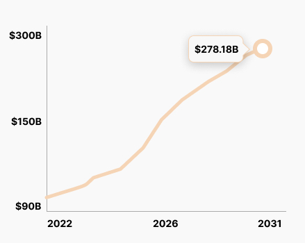
The Luxury Apparel market at the moment is worth 91.05B.
It is expected to reach 278.18B by 2031. So we can see that by these predictions, it will keep growing.
The apparel market in 2022 was worth 1.53TR U.S Dollars.
The Problem
The Customers search for high-fashion items are met with a difficult task of finding quality items and a long and tiresome return and refund process
Competitive analysis
I have researched the industry's leading competitors and picked 3 to see how they employ design patterns and user flows on their websites. This will help me better see what works and how to solve problems in my project.
It will also help me improve their solution, mainly how the buying process works on their website shops.
Chanel
Balenciaga
Saint Laurent
The Good
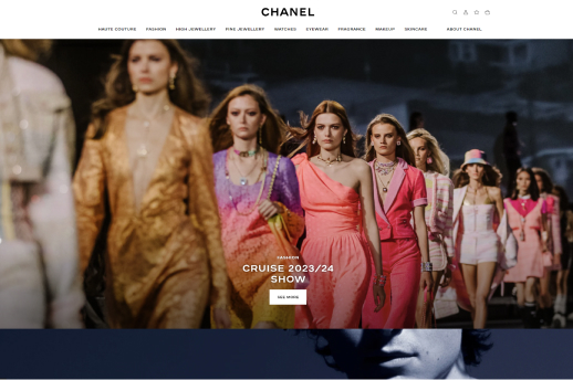
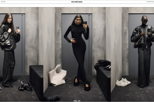
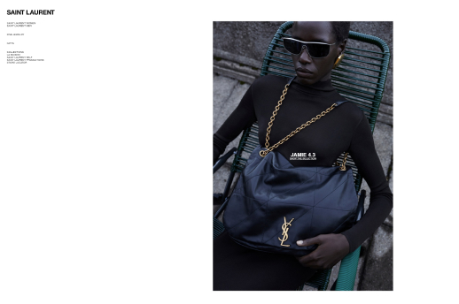
All 3 websites that I examined use extremely high-quality images. Chanel has a CTA that stands out and encourages users to click it.
The layouts and design approach is minimalistic, which gives these websites a premium feel and look. All 3 websites have a nice IA and categorization, so when you find your desired category, the flow is easy, and you can find what you are looking for. The single product pages are clean and easy to read on all 3 websites.
Chanel has a wishlist functionality so users can save their selections. At the same time, all 3 websites have store locator functionality.
As for the artistic part of these websites, they are amazing pieces of art.
The Bad
I have to continue from the last sentence above, the artistic side of these websites is amazing, and in line with the prestige that these brands convey, but from the UX part they are quite hard to navigate. You could have trouble finding any categories or individual products. Even when you find them, there is no checkout process. You can find a store, but you can’t buy it online.
Saint Lauren has a big readability issue, as the font sizes are extremely small. Also, the accessibility could be an issue, as the buttons are hard to press, because the buttons have a small click or touch area, it is easy to miss the area.
Chanel's website has quite a high loading time, due to the video-heavy site. This is certainly an aspect that they could improve.
While Balenciaga similarly to Saint Lauren has poor readability because of the font sizes. The visibility of the CTAs could be improved.
My additional observations
I have to add it. The websites are artistic masterpieces of clean and minimalistic design. However, from a UX point of view, they lack in so many categories that it is hard for the user to use them, and it gets frustrated.
I understand that many decisions were made with business in mind, and it just adds to the premium and exclusive feel of the brands to send users to physical shops.
Problems outlined by their users
The users have confirmed my findings that some websites load too slowly, have difficulty finding particular products, and have trouble navigating through the site.

Nina

Lena

Ella
User Survey
After evaluating the competitor's websites and shops, I also organized a small user survey to see what the users miss in the eCommerce shops and what would make it easier for them when buying online.
What factors are most important to you when shopping for high fashion items online?
52 participants

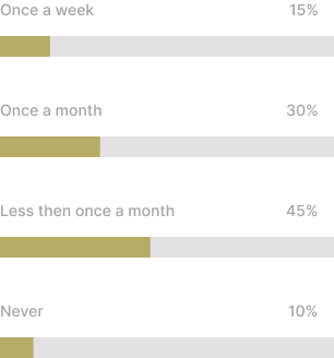
How often do you shop for high fashion items online?
52 participants
When shopping for high fashion items online, what features are most important to you?
52 participants
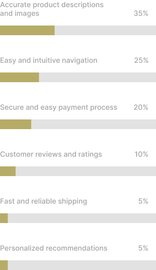

Initial research shows
Initial research shows that users value high-quality products above all. This result also validates why the big brands can go with artistic websites and gain so much from them.
The second thing that stands out is that quality images and accurate descriptions are highly valued. To this, I would also count sizing charts to help users buy clothes that fit them.
The research clearly shows that product quality and images are leading the websites and eCommerce shops in the Fashion industry. Only after that, it comes to usability.
However, if I can get the UX part right plus add quality images, I can deliver something of quality and visually stunning, that will drive sales and brand recognition.
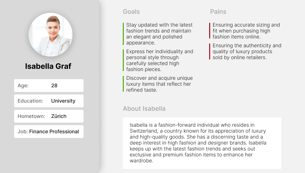
User Persona
Based on a thorough analysis of the research findings and collected data, I have created a user persona that accurately represents the target audience with a keen interest in high fashion.
Time to Design
After conducting comprehensive initial research and analyzing the data meticulously, the subsequent phase entailed creating user flows, devising a well-structured information architecture, and designing low-fidelity wireframes for the high fashion eCommerce shop.

Informational Architecture
Based on the research and collected data, I created a user persona for the type of users that would be interested in shopping for candles.

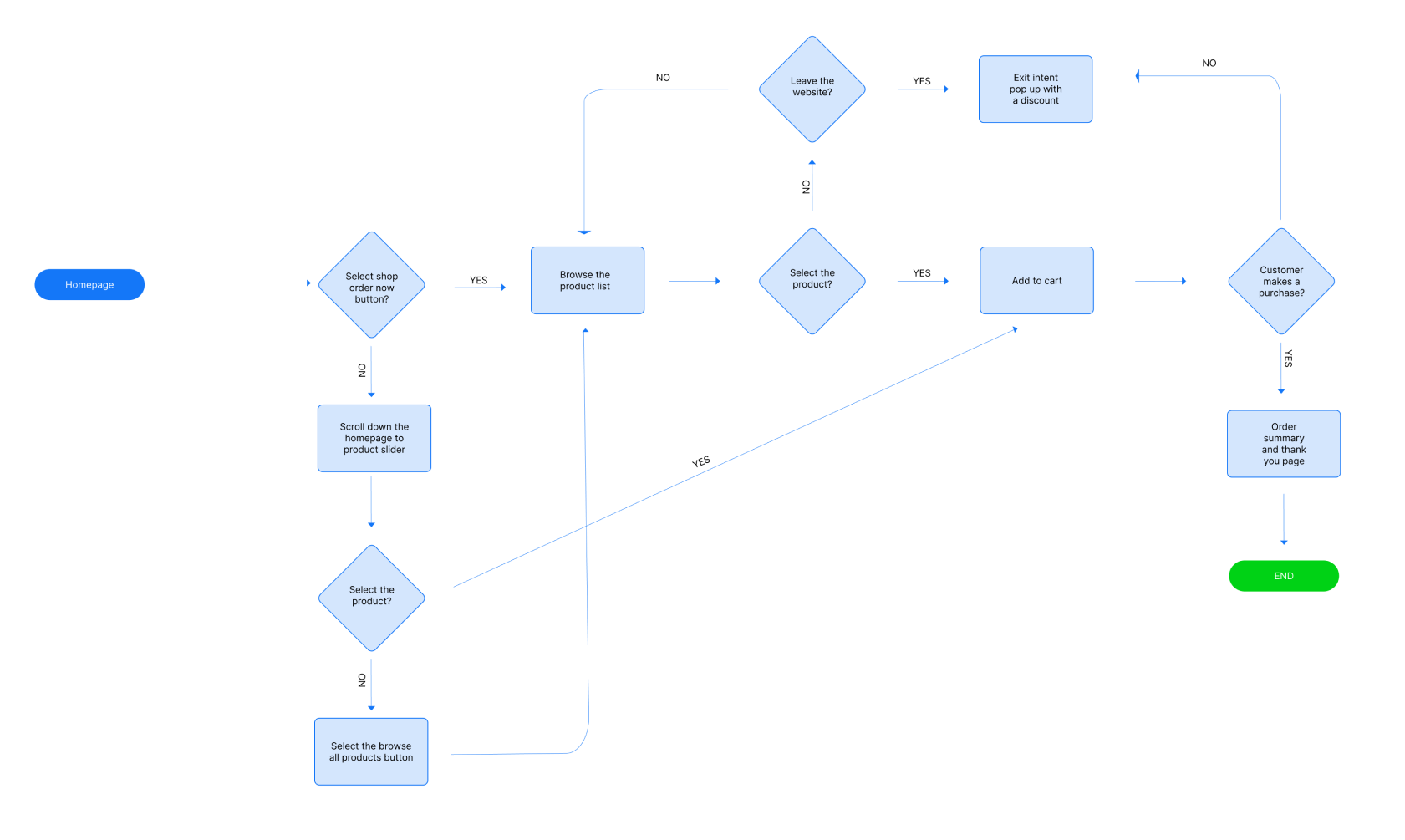
Flow Diagram
After establishing a foundational information architecture and determining the critical pages for the main structure, the subsequent step involved crafting a user flow diagram.
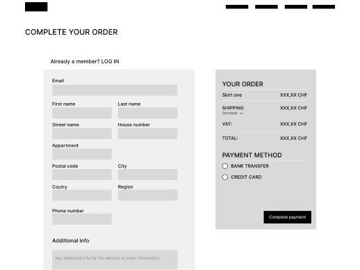
Low-fidelity wireframes
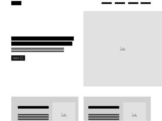
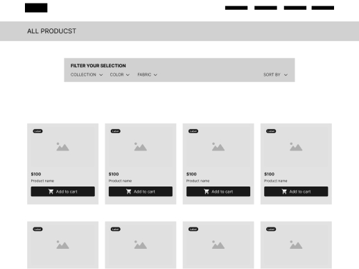
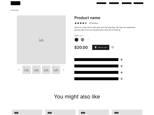
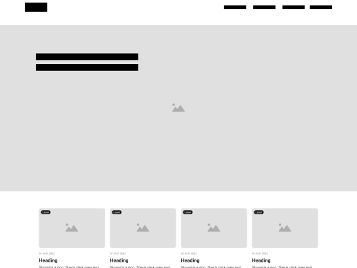
Following establishing the information architecture (IA) and main flow, I advanced to the subsequent stage of the process, which entailed crafting low-fidelity wireframes for the eCommerce shop.

High-fidelity UI Design
Once I had established the initial flow, IA, and wireframes, my next step was to create the main screens. To begin, I focused on defining the fonts and colors.
Color palette
Accent, primary, secondary, background

Font family
Cormorant Garamond
Bold
AaBbCcDdEeFfGgHhIiJj
Rokkit
Regular
AaBbCcDdEeFfGgHhIiJj
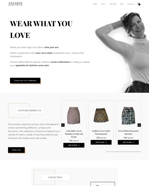
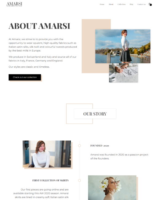
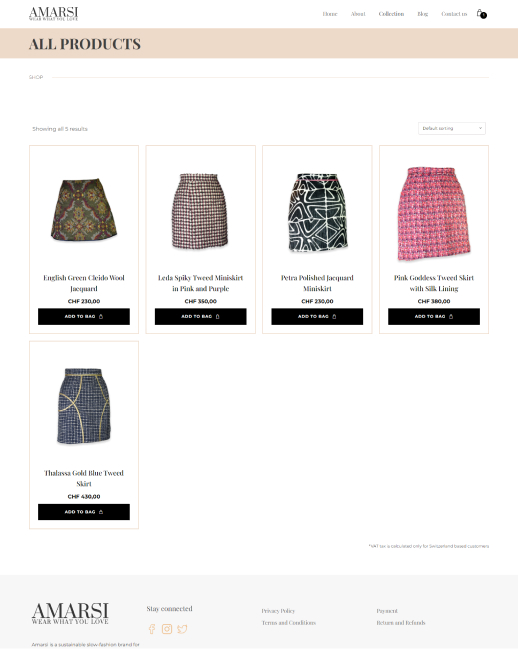
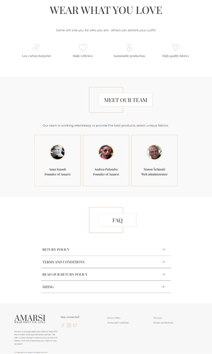
15 High-fidelity designs were created during the duration of the project
There were some experiments with the layout and styles, as I wanted to find the rigth tone and personallity for the brand. Eventually these screens were created to show the story of Amarsi.
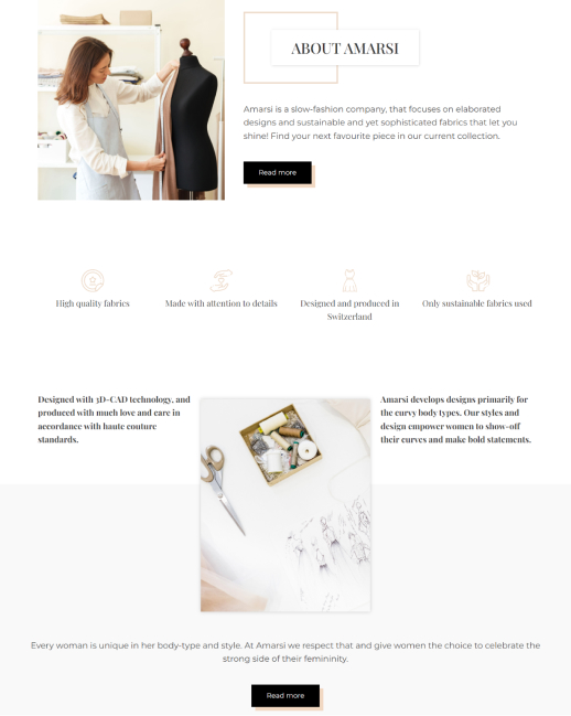
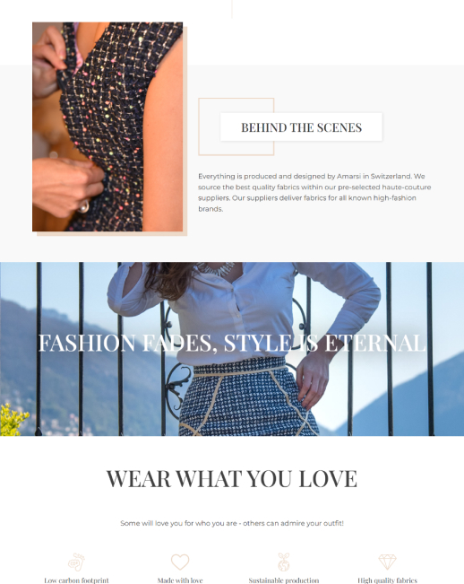
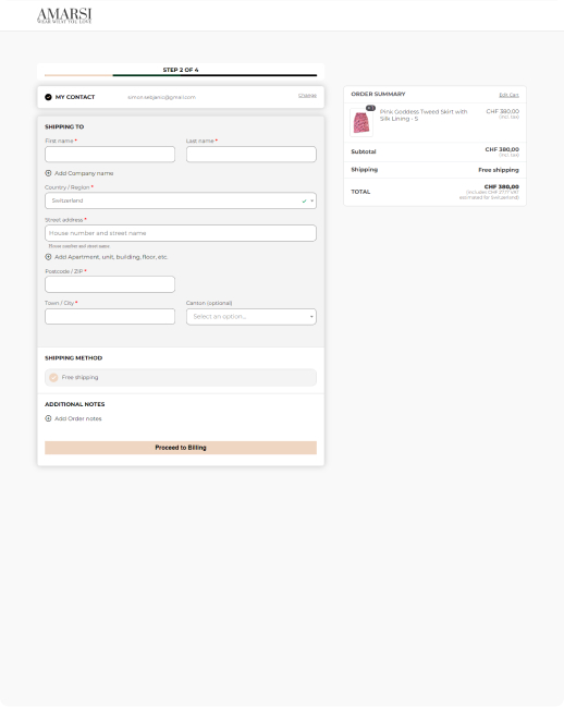
This style was also created based on my competitor analysis, as the premium brands tend to use similar color palettes. There are still some experimental screens that can be used as a basis for A/B testing to see how the website's user experience can be further improved.
High-fidelity prototype
As demonstrated earlier, I had successfully created the user flow, prompting me to further enhance the development process by creating a clickable prototype. By leveraging this prototype, I conducted initial user testing with a select group of users, evaluating the functionality and usability of the eCommerce shop.
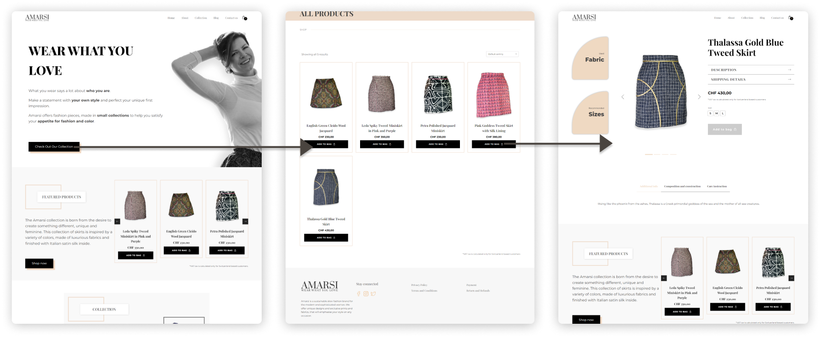
The prototype encompasses the complete buying process, commencing from the initial landing on the homepage and progressing through the shop page, where users can explore individual product pages. Subsequently, users can proceed to the checkout and complete the checkout process, ensuring a comprehensive simulation of the end-to-end purchasing journey.
Prototype validation
To validate the prototype, I conducted a usability test with 5 participants. Each participant was given a link to the prototype and a specific task to complete. The main objective of the test was to assess the users' ability to navigate to the shop page and complete the checkout process.
The assigned task for the participants was to navigate from the homepage to a specific shop page, select a product, and proceed to complete the checkout process.
The usability test was conducted via a Zoom call, where I introduced the purpose of the website, outlined the objectives of the test, and explained the tasks to the participants. During the session, I specifically inquired about the visibility of shop buttons. In addition, I evaluated the overall ease of navigation to gauge the user-friendliness of the website's navigation system.
Study results
The test results demonstrated that all users, without exception, found it effortless to navigate to the shop page and complete the checkout process.
However, it was observed that 60% of users (3 out of 5) encountered some confusion as they attempted to click on certain buttons and video play buttons that were not functional. In response, I clarified that the prototype was still in development and not all functions were available.
Further testing
This project was created on a tight budget with no further testing as possible, so I decided with the Amarsi team to go live with the prototype as an MVP and test more with data from actual visitors. To further improve the final product.
Accessibility check
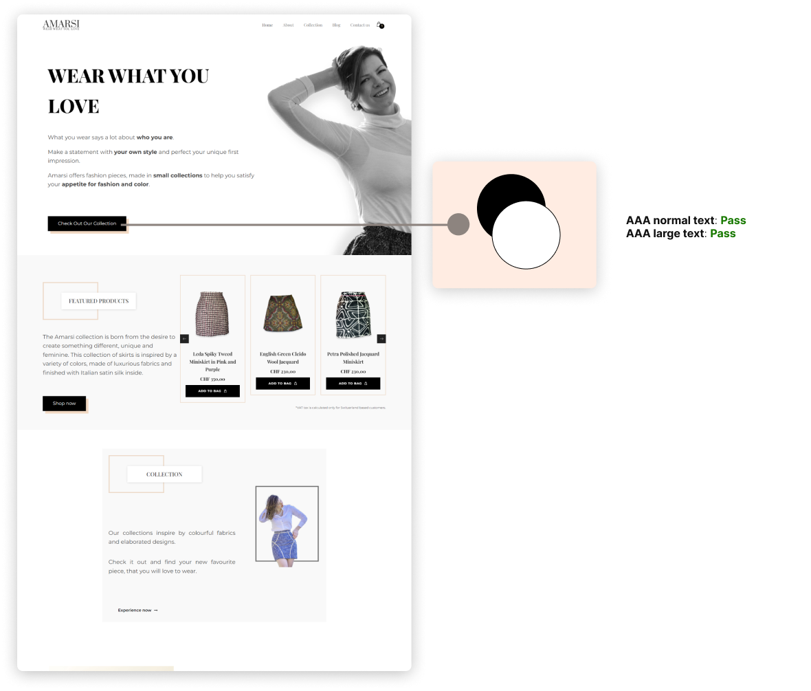
The website underwent a thorough evaluation to ensure its compliance with the AAA standards of WCAG 2.0 in terms of contrast.
After careful examination, it became evident that the website met the contrast requirements with flying colors. The contrast levels between text and background elements were highly satisfactory, offering optimal readability and accessibility for all users. This achievement enhances the overall user experience and ensures inclusivity by making the content easily perceivable for individuals with visual impairments or other accessibility needs.
Project conclusion
Working with the Amarsi team and a lovely owner was a fantastic experience. It wasn’t that I helped to get the project online, but I learned so much about the design, and the industry, that I previously didn’t know much about.
Throughout the project, I completed various tasks. These included evaluating the market, conducting comprehensive user research, developing user flows, and creating information architecture (IA) and wireframes.
Furthermore, I crafted a functional prototype and designed high-fidelity UI layouts for both web and mobile screens.
I want to add that a new brand redesign is underway at this point (May 2023). So stay tuned, as Amarsi 2.0 is coming soon.


Let's work together
PROJECT
