BlackMiles
Background
BlackMiles is a company that offers chauffeur services in Zürich. They wanted to accommodate the needs of business people that would fly to the airport and attend a business meeting in the city.
They contacted me to design a new website incorporating a reserve-a-drive functionality.
They also offer other transportation services as they have a fleet of vehicles.
My Role
As a UX/UI designer, I interviewed the stakeholders and created low-fidelity wireframes, high-fidelity mockups, user flows, and UI designs for the platform.
Problem
At the point of contact, they operate through UBER and word of mouth. So no online presence, let alone a reservation platform.
They wanted to change the way they do business and move away from the big platform. So they asked me to develop a solution to show their expertise and provide users with a quick and easy reservation platform.
Process
There were no use data available, as this will be their first online product. So I decided, together with them, to start the project as an MVP. This way, the company can launch a product and begin collecting usage data as they go and improve the product and UX and analyze the user journeys.
That being said, we took the UBER as an inspiration regarding the reservation process.
Proto User Persona
There were no use data available, as this will be their first online product. So I decided, together with them, to start the project as an MVP. This way, the company can launch a product and begin collecting usage data as they go and improve the product and UX and analyze the user journeys.
That being said, we took the UBER as an inspiration regarding the reservation process.
Based on the interviews and their goals, I started preparing a proto-persona that would serve as a starting point for the design.
User persona created:
- A businessman aged 30 - 50
- Financially independent
- Strapped for time
- In need of a chauffeur, to be able to make calls between daily transport.
Informational architecture
I created a simple IA for the website divided by the themes the company wants to showcase.

User Flow
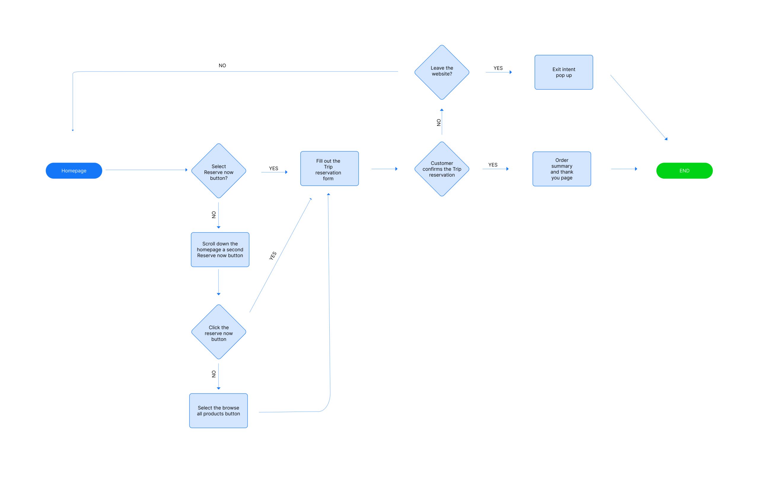
User flow is simple, as we wanted to guide the user directly to the reservation. It is intended to lead it to the form already from the homepage.
Style Guide
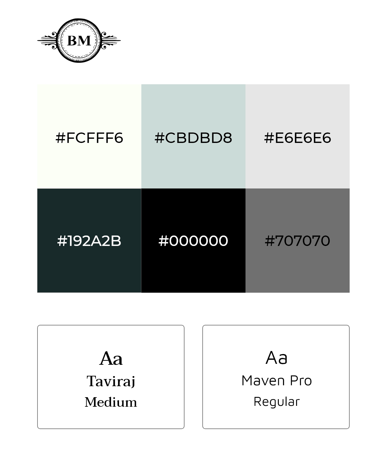
To have better consistency and a theme, I created a simple style guide for the UI design.
Wireframes
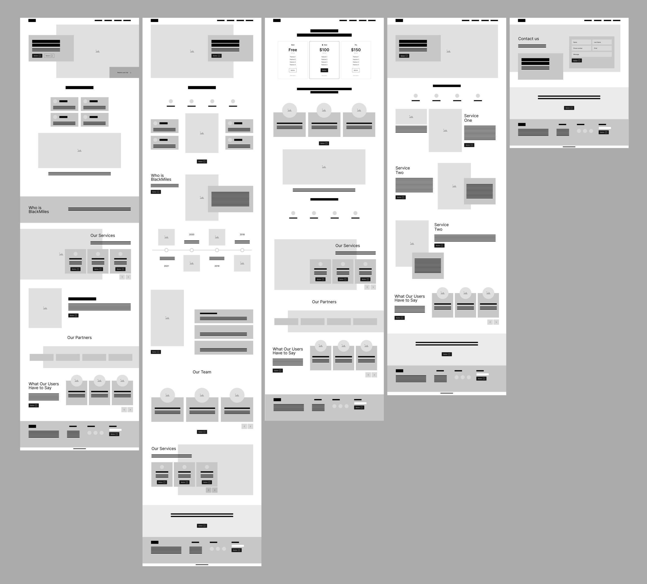
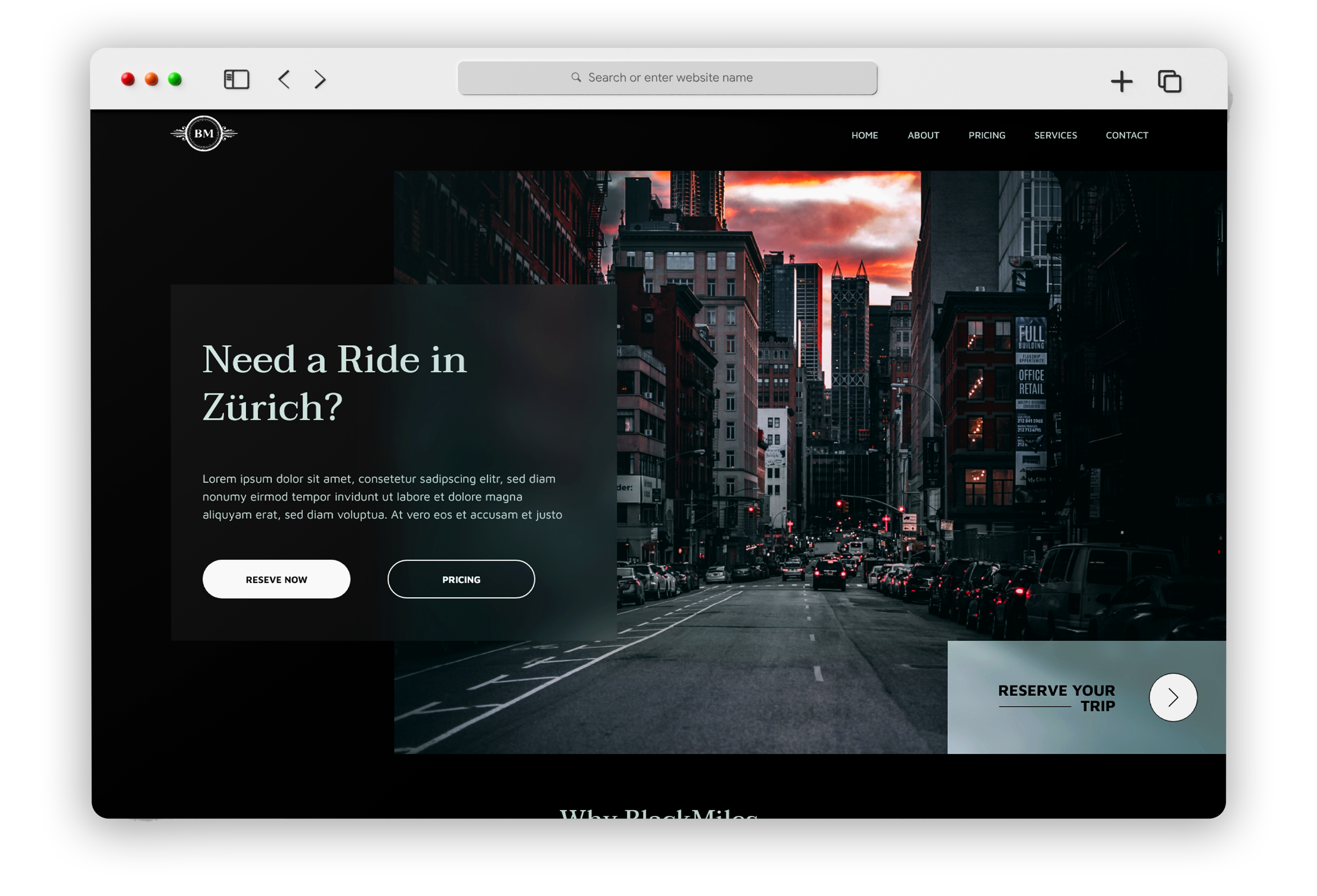
As I mentioned above, with the user flow, I wanted to ensure that the user doesn’t have to search the website on how and where to reserve a drive. Therefore, I included the CTA in the above-the-fold section of the homepage.
UI Design
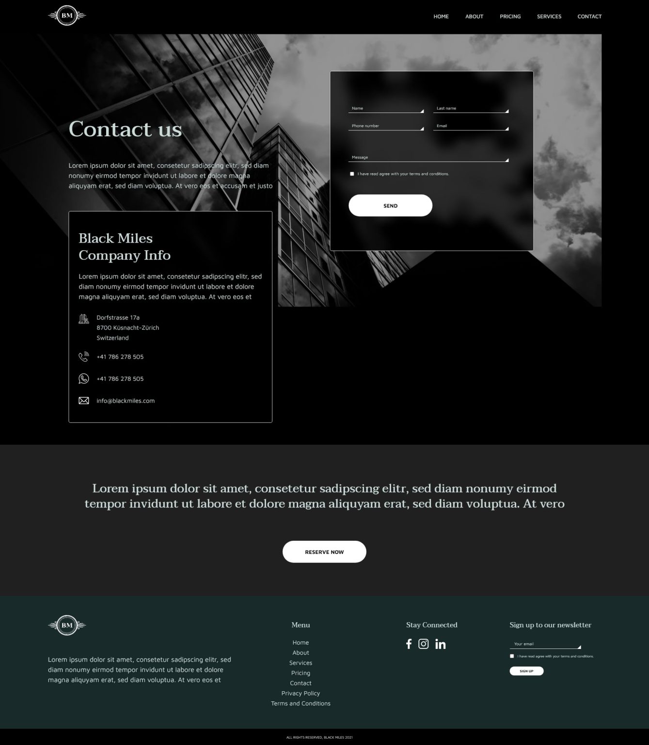
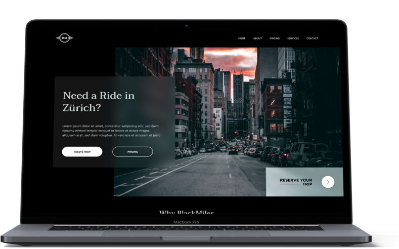
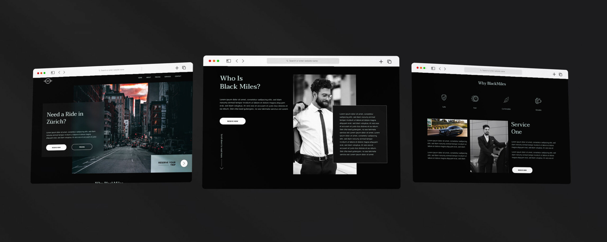
Stakeholders had an idea for a dark-themed website, so I decided to go with it. I went for a clean look and feel with the website. The website is meant to be easy to navigate and find your destination. The dark theme gave the final product a premium look and conveyed the quality of services.
Final thoughts and next steps
I liked working on the project. However, I would love more time and resources for conducting extensive user testing sessions, allowing me to develop the product even further before the handoff.
As mentioned before, this is another MVP, so the next step after the launch would be to collect usage data, test out improvements, and fill the gaps in UX.
Despite limited resources, BlackMiles developed a strong foundation for the website.
PROJECT

