KredenzEcke

What made me take on this project
I was in as soon as they reached out with the idea for a coffee shop and an eCommerce website to sell Italian coffee.
I love coffee, and because of that, I also have some insights into how hard it is to find quality coffee beans online. You can find coffee beans through brick-and-mortar stores, but now as much online. That is why this was a fantastic opportunity to create a product that would make it easier for coffee lovers such as me
Market Research
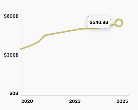
The Coffee industry has been steadily growing in the past few years. The market is now estimated at $495.5B globally. Projected to grow to $540.8B by 2025.
This means that the industry size will almost double compared to 2020.
The Problem
Customers that search online have a very limited selection of quality eCommerce shops.
Competitive analysis
I analyzed 3 competitor e-commerce websites in the Coffee industry - looking at how they presented the Coffee beans and their ordering and checkout experience to find patterns in design and flow.
Furthermore, I conducted research to gather customer feedback regarding their solutions and their experiences navigating the ordering and checkout process.
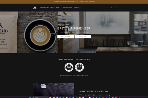
The Barn
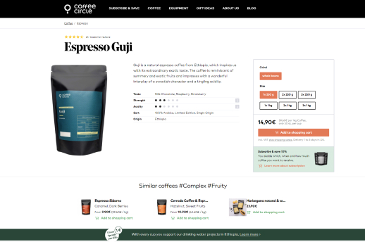
Circle Coffee
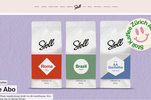
Stoll Kaffee
The Good
All three websites use quality imagery. The Stoll Kaffee website has excellent text readability and offers capsules. Additionally, the Stoll Kaffee eCommerce website has a nice flow, and the hierarchy helps to make the website scannable.
All websites offer a variety of payment options. Shopping as a guest is available at The Barn and Stoll Kaffee. The Barn and Circle Coffee take into account accessibility, as they offer their eCommerce website in different languages. Circle Coffee and Stoll Kaffee offer subscription-based shopping.
The Barn has an easy-to-use multistep checkout.
The Bad
The Circle Coffee website allows only registered users to complete the checkout process. The Barn and Circle Coffee have a poor hierarchy and additionally don’t have the best readability. None of the websites offer wishlist functionality.
The navigation on all 3 websites is missing a clear CTA, making navigating the website more difficult. On Circle Coffee, there is some poor contrast in some elements. In addition, the product descriptions are a bit vague.
Problems outlined by their users

Max

Thomas

Cecile
User Survey
I administered a survey utilizing Google Forms to individuals who expressed an interest in purchasing coffee beans.
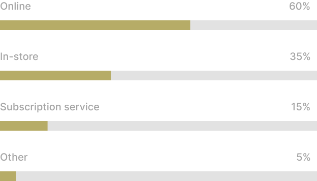
What is the most important factor in your decision to purchase premium coffee? (Select one)
74 participants
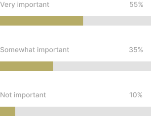
How important is it to you to have the ability to save your favorite products for future purchases or reference?
74 participants
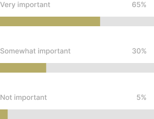
How important is it to you to have detailed product descriptions and images available when considering purchasing premium coffee online?
74 participants

Initial research shows
Because of busy life and time constraints, users buy coffee beans online quite frequently. It also shows that they want a detailed description of what they are buying.
Additionally, they want to have the option to save products and buy them later. This can also be used to retarget users with personalized ads.
The brand can also capitalize on the fact that users want quality coffee.
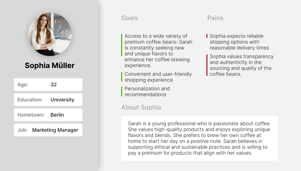
User Persona
After analyzing the research findings and gathered data, I developed a user persona representing the target audience interested in shopping for candles.
Time to Design
After the initial research and careful analysis of the data, it was time to create user flows, informational architecture, and low-fidelity wireframes for the eCommerce shop.

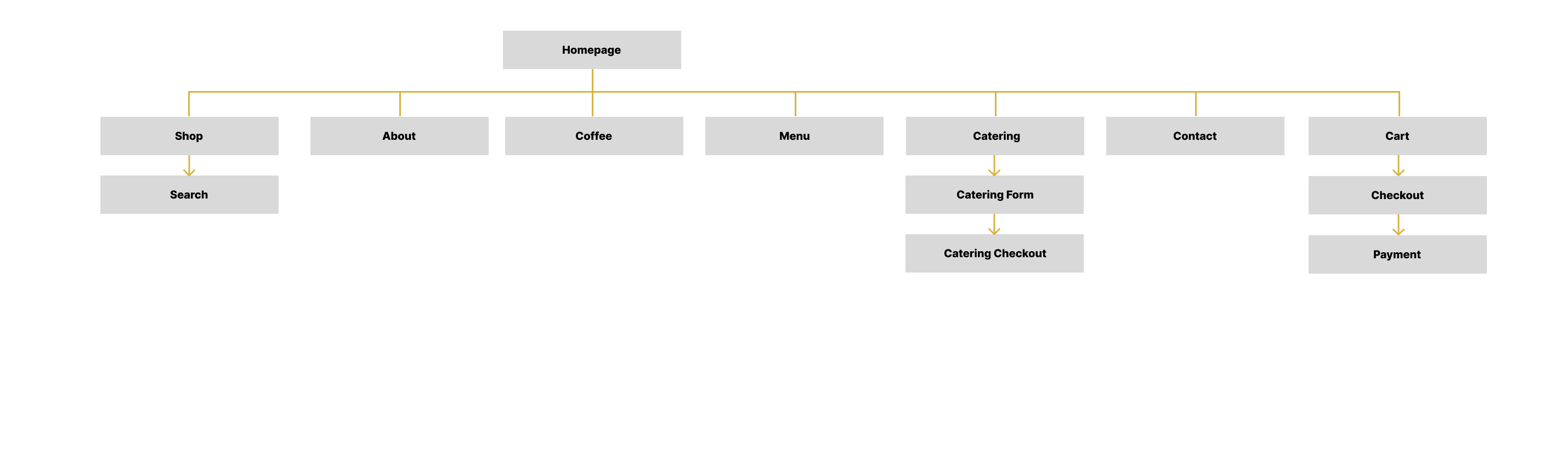
Informational Architecture
First, I proceeded to lay out an IA on how I wanted my sitemap to look and how the pages would be categorized.
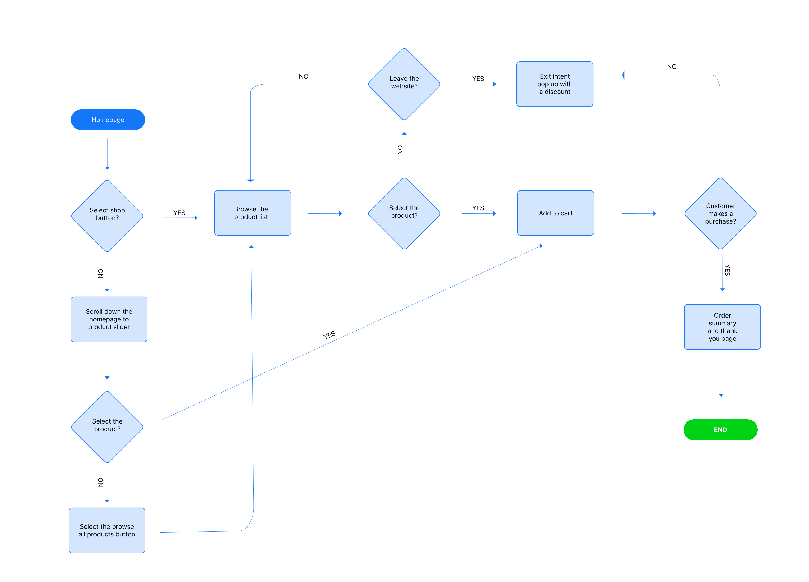
Flow Diagram
Once I had a basic IA and which pages will be in the main structure it was time to prepare a user flow diagram.
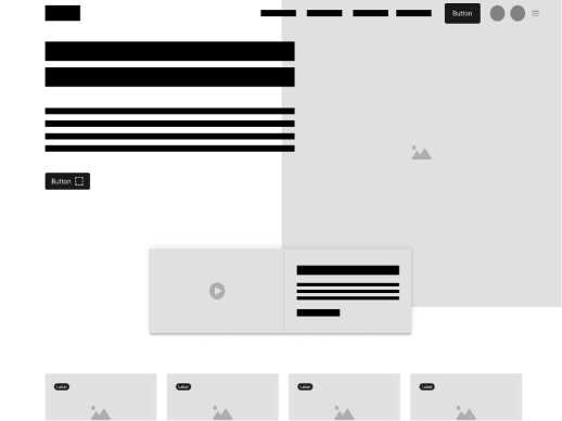
Low-fidelity wireframes
After establishing the IA and main flow, I proceeded to the subsequent stage of the process, which involved developing low-fidelity wireframes for the eCommerce shop.
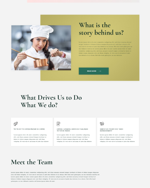
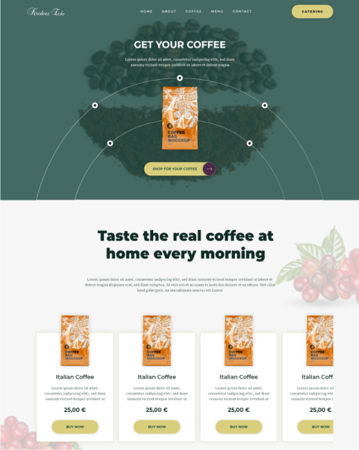
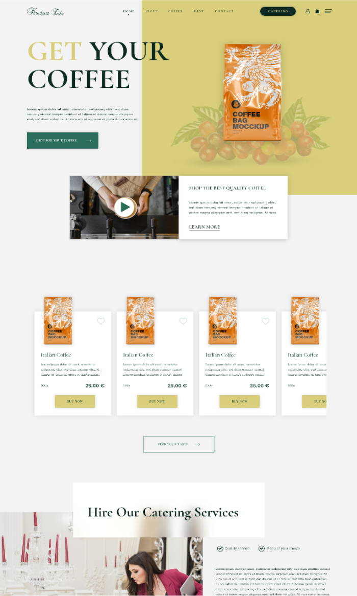
High-fidelity UI Design
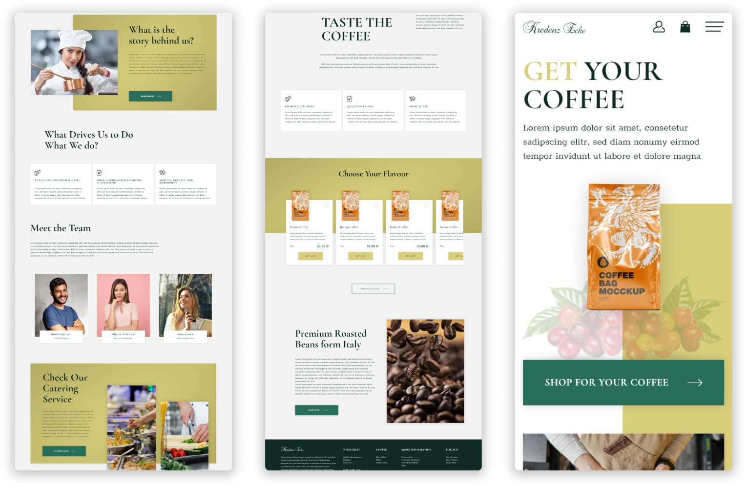
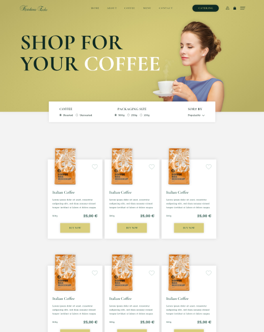
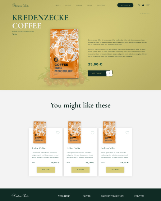
Once I had established the initial flow, IA, and wireframes, my next step was to create the main screens. To begin, I focused on defining the fonts and colors.
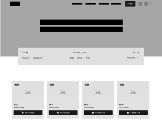
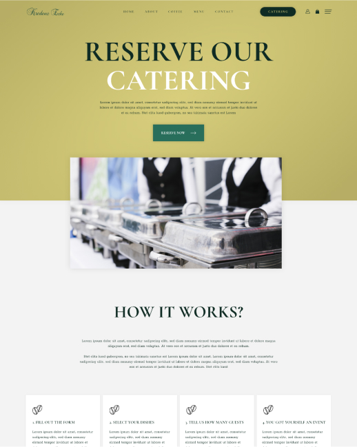
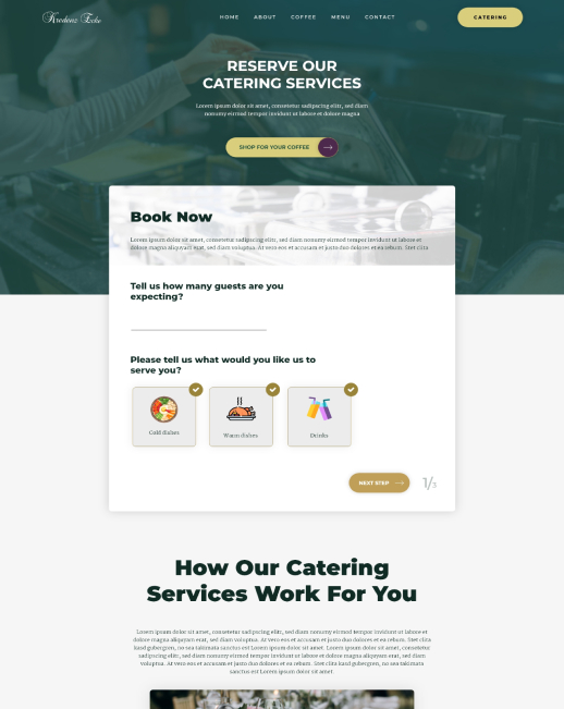
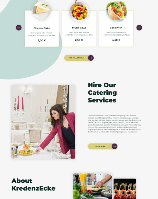
As you will see, I also added the wishlist functionality as per the user survey. In addition, there is also a page for catering services that the coffee shop offers.
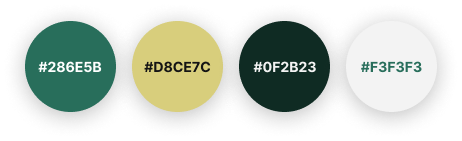
Color palette
Accent, primary, secondary, background
Decorations

Font family
Cormorant Garamond
Bold
AaBbCcDdEeFfGgHhIiJj
Rokkit
Regular
AaBbCcDdEeFfGgHhIiJj
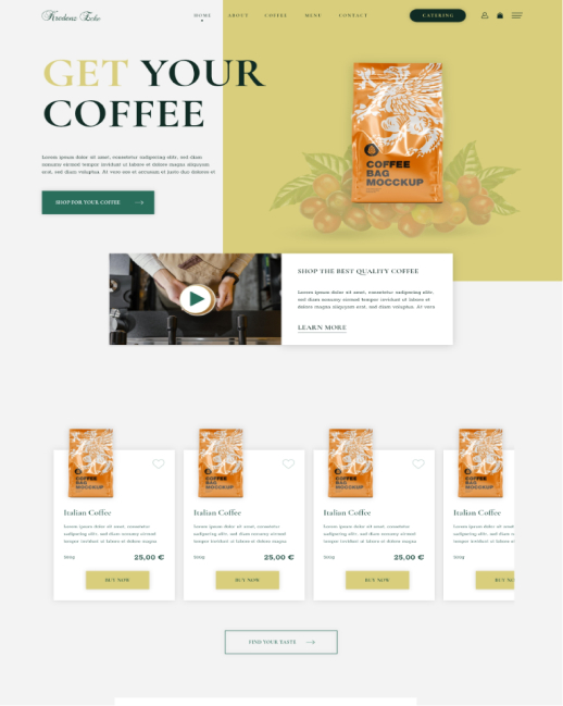
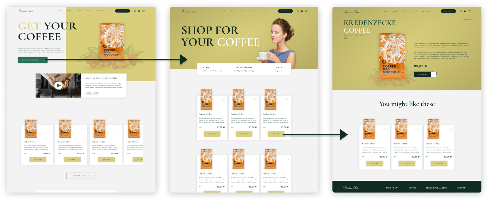
22 High-fidelity designs were created all togheter
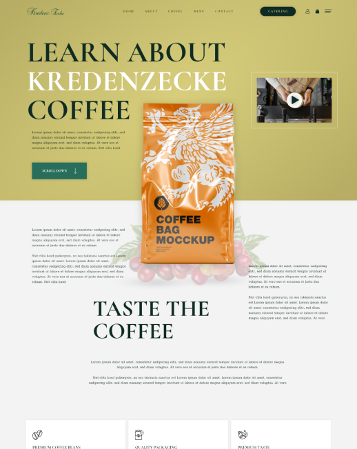
I experimented with different layouts and styles for the homepage and catering services page, as shown in the experiment section below. The design was different in layout and font style.
Including an experiment with different design style
These screens below were designed first, and later through the iterations, I created the main screen design for this project.
You can see that besides the design and layout differences, there is also a distinction in navigation and button styles.
The main style and layout design were selected because we were following a bit more of a premium feel and ease of use with better descriptions.
Grid and alignment
For this project, I opted for an 8-point grid system and determined the margins between groups at 16, 24, and 80 based on the relationships between sections.
High-fidelity prototype
As you saw above, I had the user flow created, so I also decided to create a clickable prototype. This prototype has allowed me to test the eCommerce shop on the first group of users.
The prototype encompasses the entire buying process, from landing on the homepage and progressing to the shop page, where users can explore individual product pages. Afterward, they can proceed to the checkout and complete the checkout process.
Prototype validation
To validate my prototype, I performed a usability test involving 5 users. Each participant received a link to the prototype and a specific set of tasks. My objective was to ensure that the users could navigate to the shop page and access a detailed preview of the selected product.
The single product page held significant importance, mainly because I incorporated a more detailed description based on the user survey.
The second task involved users adding the product to their cart and completing the checkout process. This was done to ensure the checkout process was user-friendly, easy to understand, and aligned with legal requirements.
Additionally, I conducted testing for the catering service reservation. It was crucial to ensure that individuals interested in booking the catering service could easily comprehend the process and assess the clarity of information provided throughout.
The test was carried out through a Zoom call, during which I provided an explanation of the website's purpose and test objectives and outlined the tasks the participants were to perform. Additionally, I posed inquiries regarding the visibility of shop buttons and the ease of navigation, aiming to assess the user-friendliness of the website's navigation system.
Study results
The test revealed that all users, without exception, found it effortless to navigate to the shop page and open a single product page.
Also, they didn’t have any problem with completing the buying process.
However, 60% of users (2 out of 5) did find it a bit confusing not being able to click on the quick filter tabs on the shop page. This is where I had to explain that this is still just a prototype and that not all functions are available. The same happened on the homepage with trying to play the video.
Further testing
Due to limitations in time and budget, conducting extensive testing was not feasible. As a result, we decided to push this prototype into development as a Minimum Viable Product (MVP). The plan is to conduct additional tests and observations on the live product, enabling us to gather more data and perform A/B testing to enhance the development further.
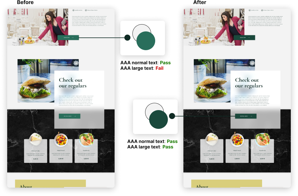
Accessibility Check
The website was eveluated for contrast to match the AAA standards of WCAG 2.0.
I found that my buttons weren’t passing the AAA standards for large text. So I did a quick modification to make the button darker. After a new accessibility check, the contrast matched the AAA standard on normal and large text.
Project conclusion
A fantastic project to work on. Especially as I also love coffee, so to be working on a coffee shop eCommerce website was a tremendous experience.
While working on this project, I evaluated the market, conducted user research, and built user flows, IA, and wireframes. I also created a working prototype and designed high-fidelity UI designs for web and mobile screens.
To conclude the project, I also did an accessibility check and corrected button colors for better accessibility.