NeuroBeans
Background
NeuroBeans is a brand that helps kids cope with their AD/HD disorder. The company produces a toy that helps kids overcome or at least ease the symptoms of AD/HD. In addition, they have obtained national certificates that prove the toy works.
Besides the toy, NeuroBeans offers classes to parents, kids, and schools in Slovenia to help kids get better grades and again find the ability to concentrate.
The project was in full swing and was fully deployed to gain EU funding for the digitalization of small businesses. But after a year, the company had another opportunity to gain more significant funding, so they decided to redo the website and the platform again.
Summary
Toys and more so tools that would help children to cope with AD/HD in Slovenia are rare. So this was an outstanding opportunity for the founder, a neuroscientist, to penetrate the market with his invention. More so to gain funding. So together, we decided to go for digitalization funding and help boost the business.
Problem
The problem, which was identified early on, was that the product and classes could be hard to market. As it can be entertaining, the toy is still analog, not a digital one. They did have a digital app where you could put in your progress, but as with many other things, something good for you is not that interesting or engaging. So we had to do an excellent job presenting the benefits of the toy and classes for children.
Solution
We decided to approach the problem by creating a digital product that would bring awareness to parents that there is a fun, easy, and not time-consuming process of helping their children cope with AD/HD. The visual language must be engaging to both parents and children. It was the only solution that would generate good results.
Key questions
The key questions we encountered were how to present the toy and the classes engaging to both parents and children? How to make the user experience enjoyable for parents so they will be excited to use the website and buy the toy. How to present the benefits and advantages of the product in a fun way?


Tought process
From the start, we knew we had a project full of challenges in front of us. First, we had to ensure the toy differed from the rest. At the same time, we also knew that the user flow on the website must be simple and fast.
Research
We started with competitive research with the NeuroBeans team to see where the brand stands out from the rest. Together with them, we also prepared a quick questionnaire for parents, so we could get the data on what they would be expecting from our digital product. The interviews were conducted in schools with their permission.
Ideation
Based on these ideas, we created different wireframes. Finally, we created UI designs and prototypes when we selected the right fit. The main point was not to promote eCommerce but to focus on presenting the toy and classes—building awareness. As the toy would be primarily presented in Schools, it would gain traction from there.
Visual design
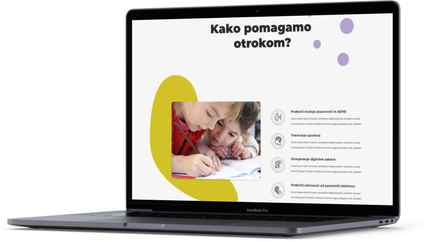
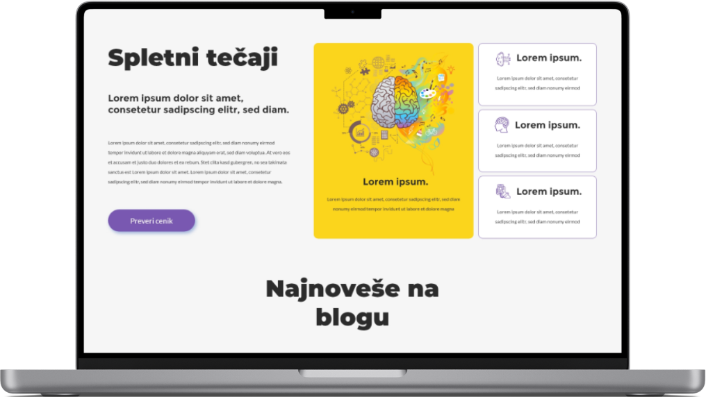
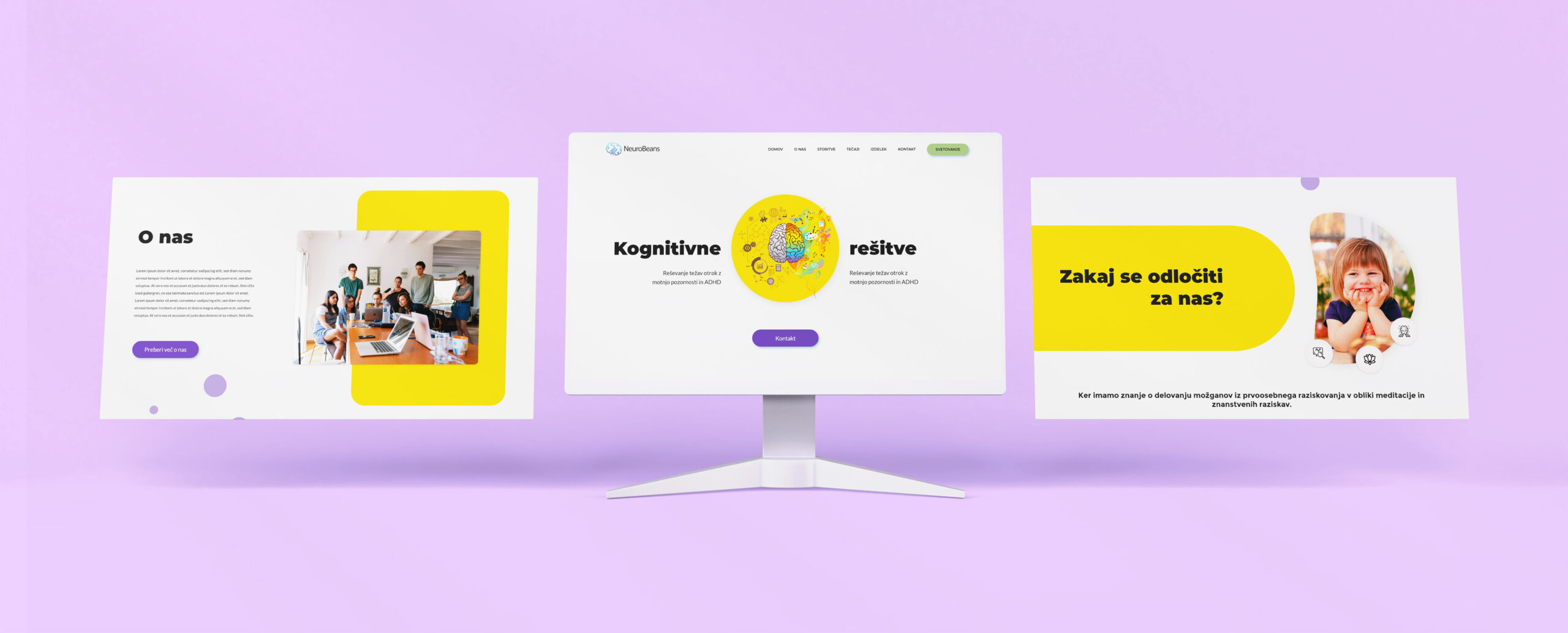
For us, the visual language of the website needed to be friendly, fresh, and playful. With this kind of visual language, we were going for parents to see the fun and helpfulness of the toy, especially the classes. But, at the same time, the website had to convey the brand's expertise.

Conclusion
With the project at its end, we believe we have found the right mixture of excellent user experience and engaging user interface. The result was an attractive website aimed at bringing awareness to the difficulties and solutions of AD/HD disorder.
The user interface is playful, colorful, and clean. It stands out from the competitors.
NeuroBeans goals should be now focused on marketing and bringing in the traffic, collecting user usage data and building upon for an even better user experience, and developing the design even further.
PROJECT
