
GoodByeJar
What made me take on this project
The project was intriguing initially, as they are trying to help adults and children battling with ADHD. It is also a therapy for adults to eliminate their addictions and bad habits. It was an exciting concept of a website, e-commerce shop, reservation platform, or marketplace for coaches.
This was something that I saw myself as a part of and helped with my skills to help them reach more people they can help.

Market Research
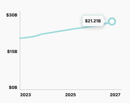
The mental health industry's size 2023 will be 20.09B dollars worldwide. It is steadily growing.
The market size is projected to increase by more than 1B dollars by 2027. This means the market size will grow by 1,37% a year.
The Problem
Customers that search online have a minimal selection of quality eCommerce shops and reservation platforms to find help.
Competitive analysis
I found some competitors for the services residing in Slovenia. Therefore, I chose 3 to create a competitive analysis, which will help me identify some of the patterns they use to book a call or a therapy.
I was particularly interested if the offer 1 on 1 coaching and if they offer coaches the opportunity to be listed and hired by the users.
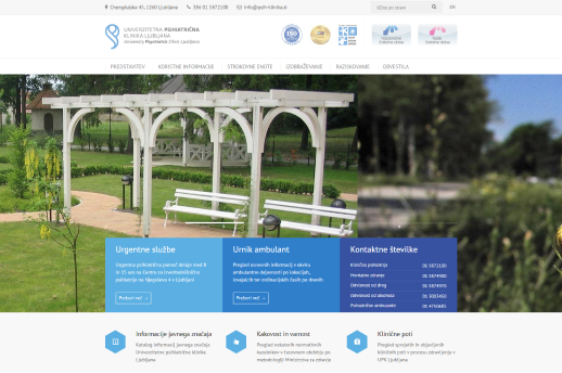
Psychiatric Clinic Ljubljana
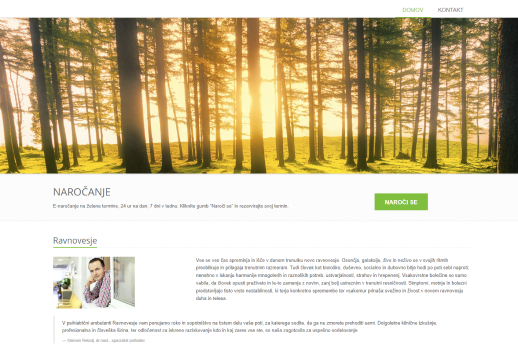
Clinic Ravnovesje
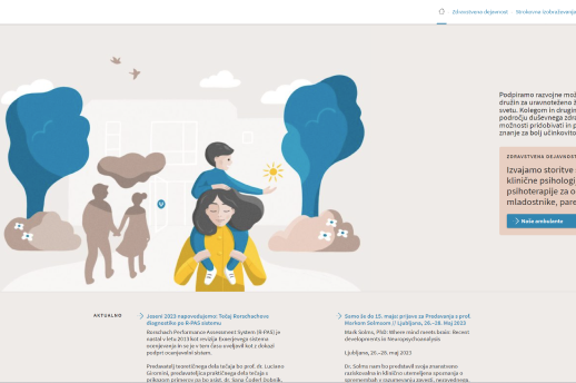
IKPP
The Good
2 out of 3 websites use quality relaxing images as they should, considering their industry. These 2 are Psychiatric Clinic Ljubljana and Clinic Ravnovesje. The IKPP has good visibility of the CTA, as does the Clinic Ravnovesje website.
The Clinic Ravnovesje offers the selections of the preferred date, but only to the subscribers. All 3 websites have a contact form to send inquiries.
The hierarchy is quite good on all three sites. However, some instances should be improved.
The Psychiatric Clinic Ljubljana has its news and messages right in front of the user as they land on the website, so the user is informed. The same goes for important information about contacts and schedules.
While the IKPP keeps the user informed on the homepage, they don’t show other information.
The Bad
The Clinic Ravnovesje is missing the contact information right from the get-go, and no contact or schedule info on the homepage. The contact information is also an issue on the IKPP website.
All 3 websites have quite out-of-date UI. While on the Psychiatric Clinic Ljubljana, the website still holds on; the other 2 are quite hard to read and follow. The reading patterns are not used as they should be. And as mentioned before, the hierarchy could be improved.
The navigation on Clinic Ravnovesje is quite bad and hard to spot when you move away from the homepage. This means it can frustrate the user, which means a higher bounce rate.
User Survey
I have also done a user survey to know more about what the users are looking for, as my project isn’t just an info website but combines the shop and reservation platform. The main focus was on the counseling the users wanted most.
What types of consultation services would you or someone you know be interested in? (Select all that apply)
61 participants
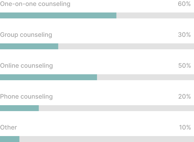

Initial research shows
The users are looking for 1-on-1 counseling, which should preferably be done online.
These findings are helpful as to I can draw out what the website should combine to help the users find the solution and what the company has to offer to meet the users needs.
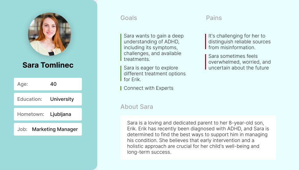
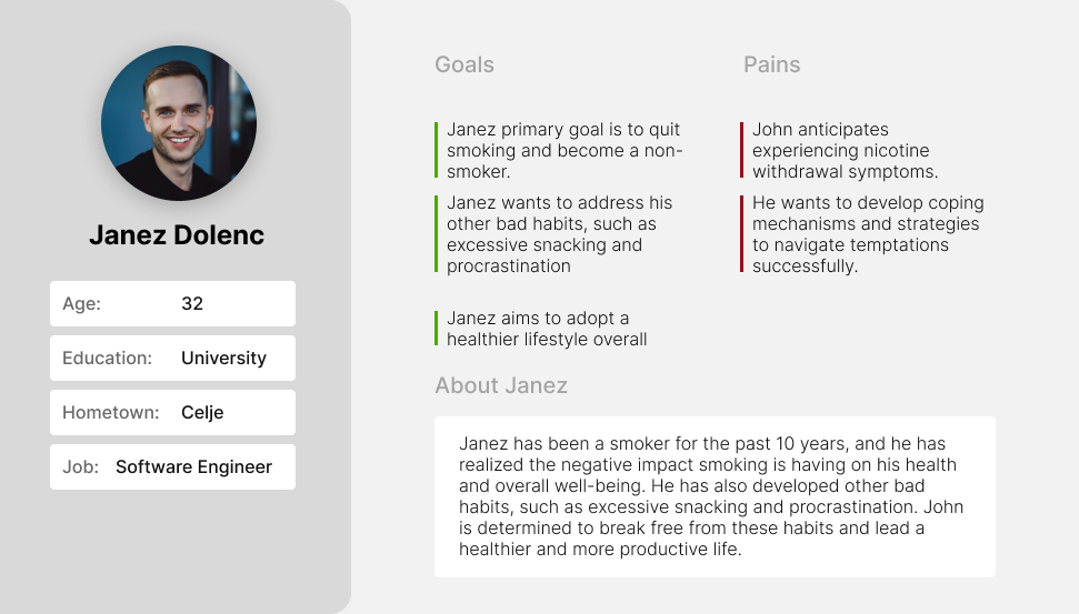
User Persona
I created two personas because the website also targets children battling AD/HD. The first is a mother who wants to help her children improve at school and their lives as they prepare for adulthood.
While the second user persona is an adult that has recognized his bad habits and is looking for a solution that would work with his busy schedule.
User Persona Parent
User Persona Adult

Time to Design
After I did the initial market research and user survey, I got enough data to start and prepare user flows, informational architecture, and wireframes that will be the base for my High-fidelity UI designs for the eCommerce shop and reservation platform.
Informational Architecture
Based on the research and collected data, I created a user persona for the type of users that would be interested in shopping for candles.
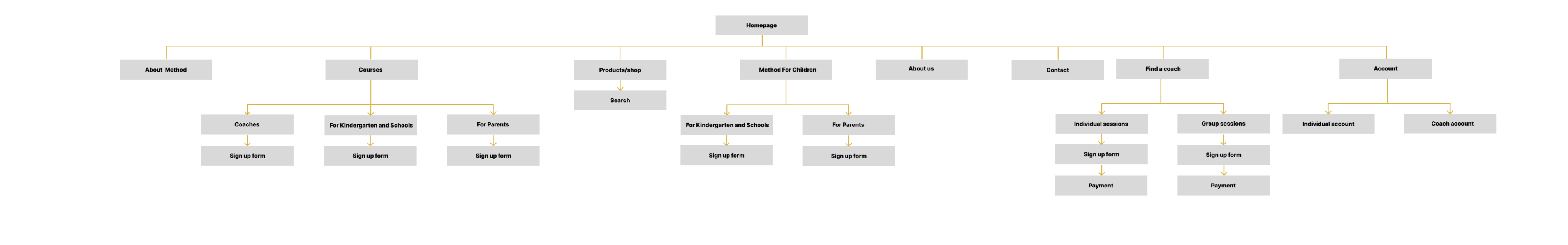
To view IA as a PDF please click here.
Flow Diagram
Once I had an IA created, I started to create flow diagrams. I made 3 separate diagrams for all the functions the website will provide the users.
Below are the flow diagrams for shopping in the eCommerce store, sending an inquiry about a course, and finding a coach.
Flow diagram for Find a coach process
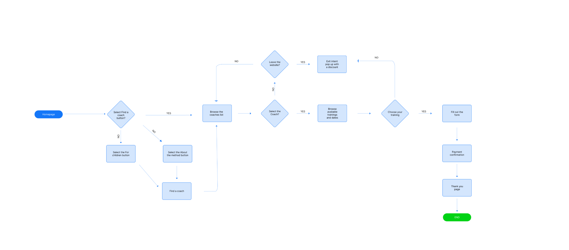
To view flow as a PDF please click here.
Flow diagram for Send an inquiry about a course process
To view flow as a PDF please click here.
Flow diagram for Buy a product process
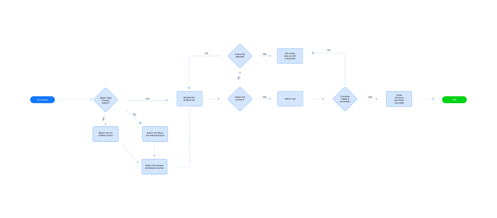
To view flow as a PDF please click here.
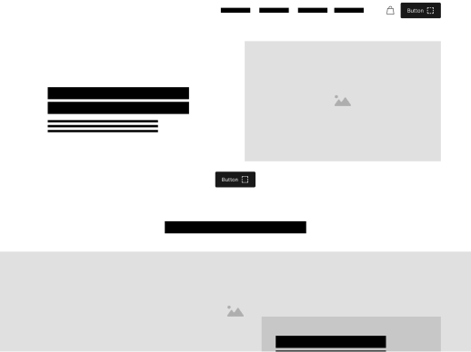
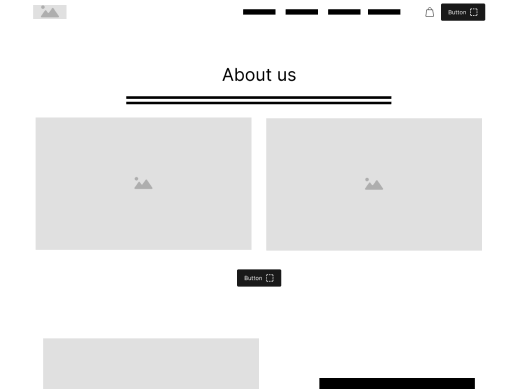
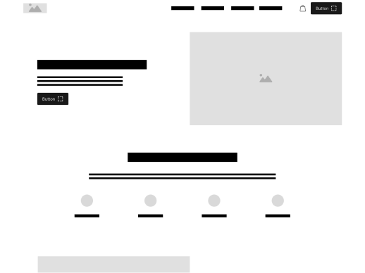
Low-fidelity wireframes
Once the information architecture (IA) and main flow were established, I transitioned to the next phase of the process, which entailed creating low-fidelity wireframes for the eCommerce shop.

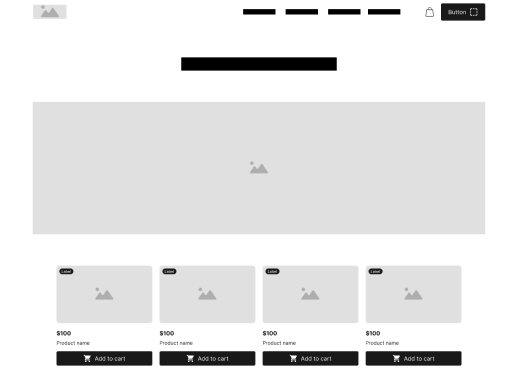
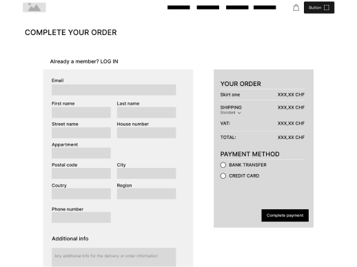
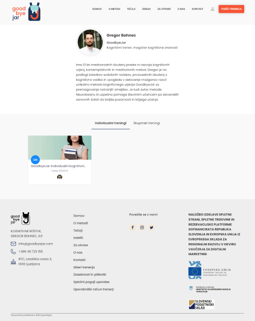
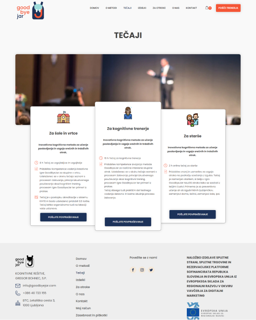
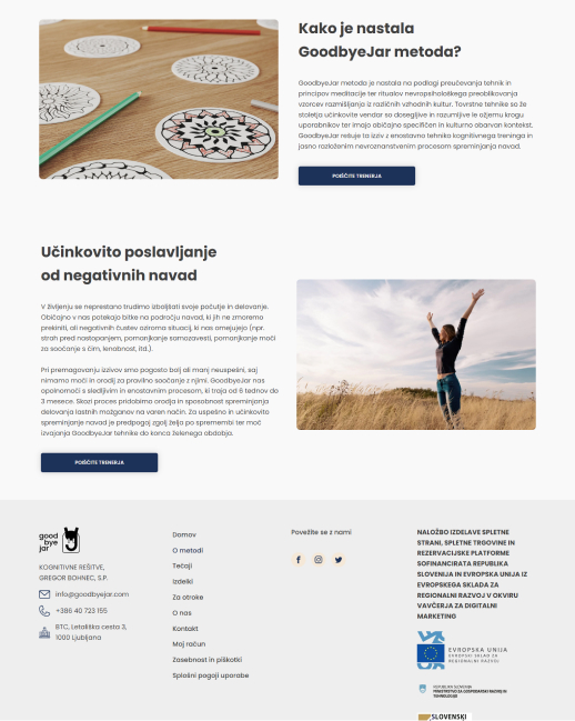
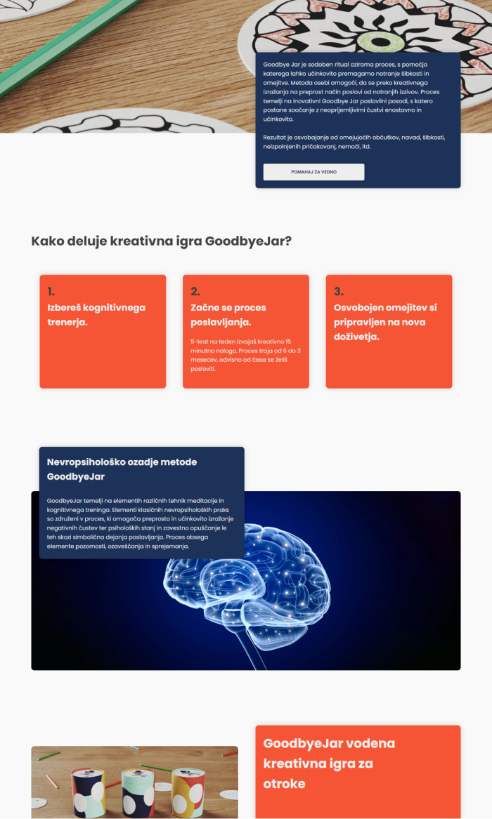
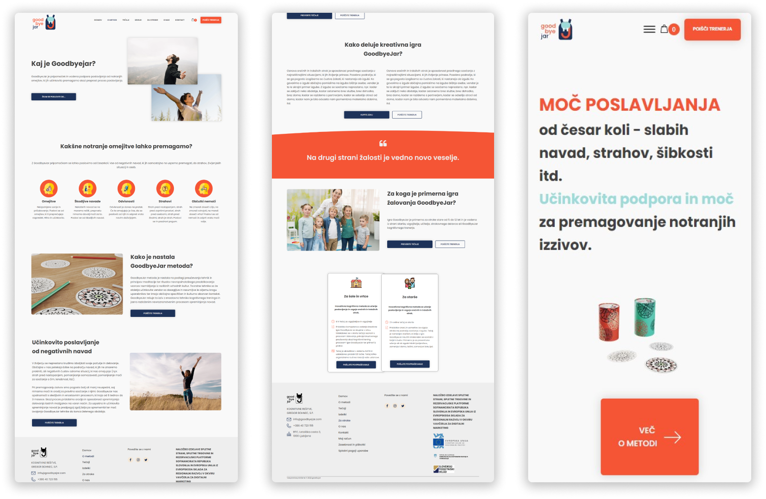
High-fidelity UI Design
After finalizing the initial flow, information architecture (IA), and wireframes, my subsequent task involved crafting the main screens. Initially, my focus revolved around determining the fonts and colors to be utilized.
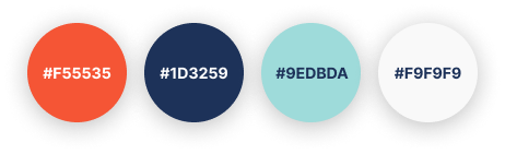
Color palette
Accent, primary, secondary, background
Font family
Poppins
Bold, Medium, Light
AaBbCcDdEeFfGgHhIiJj
26 High-fidelity designs were created all togheter
There was some experimentation with different colors that I could use by generating more color palettes and some other layouts, especially on the homepage.
Together with the GoodByeJar team, we decided to move forward with the screens you can see here. But we have stayed open to testing other layout iterations with the live site to improve further the user experience of the services provided.
Grid and alignment
For this project, I opted for an 8-point grid system and determined the margins between groups at 16, 24, and 80 based on the relationships between sections.
High-fidelity prototype
As you saw above, I had the user flow created, so I also decided to create a clickable prototype. This prototype has allowed me to test the eCommerce shop on the first group of users.
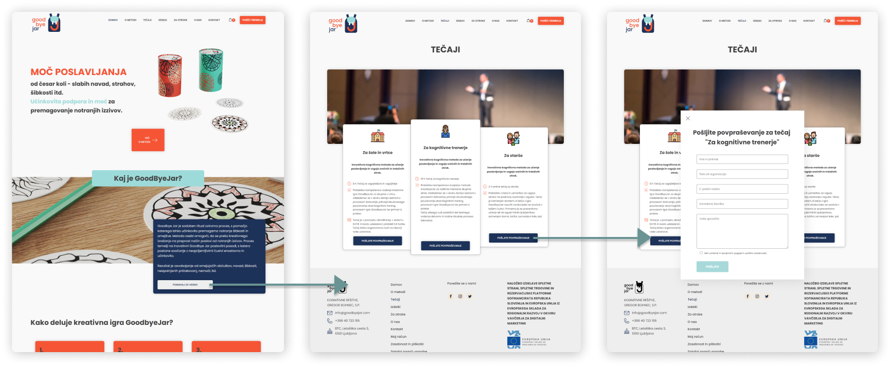
The prototype I decided to show in the case study demonstrates the process of a user sending an inquiry about a particular course that they can access online.
You can see that the user lands on the homepage and then proceeds to scroll down the page and select the button to go to courses, where he can choose a course. After the user selects the course, a pop-up with a form emerges.
Prototype validation
To validate my prototype, I performed a usability test involving 6 users. Each participant received a link to the prototype and a specific set of tasks. I aimed to ensure users could navigate to the course page and send an inquiry.
The course page was significant because the company wanted to market the courses to adults and schools. This was how they got more prominent clients to contact them.
The second task was to find a coach and schedule a training session with them. This could either be a group session or 1-on-1 session.
I also added the third task: buying a product from the shop page.
The test was carried out through a Zoom call, during which I explained the website's purpose and test objectives and outlined the tasks the participants were to perform. Additionally, I posed inquiries regarding the visibility of shop buttons and the ease of navigation, aiming to assess the user-friendliness of the website's navigation system.
Study results
The test revealed that all users, without exception, found it effortless to navigate to the course page and send an inquiry about a course.
Also, they had no problem finding a coach and scheduling a session.
However, 66,67% of users (4 out of 6) did find it a bit difficult to find a shop page, as the page isn’t obvious.
As I wanted to correct the issue, the GoodByeJar team asked me not to make it more visible, as the course page is far more critical than the shop. This is why the Find a Coach and course pages are easier to navigate.
Further testing
Considering the time and budget constraints, conducting comprehensive testing was not practical. Therefore, we opted to move forward by transitioning the prototype into development as a Minimum Viable Product (MVP). Our strategy involves conducting further tests and observations on the live product, enabling us to collect more data and conduct A/B testing for other product improvements.
Project conclusion
Working on this project has been truly inspiring. It is a project that I firmly believe will positively impact numerous individuals by improving their lives and aiding them in overcoming challenges and addictions.
Throughout the project, I successfully completed various tasks. These included evaluating the market, conducting comprehensive user research, developing user flows, and creating information architecture (IA) and wireframes.
Furthermore, I crafted a functional prototype and designed high-fidelity UI layouts for both web and mobile screens.
The experience was also a special recognition for me as EU funds funded the project through the Slovenian Ministry of Economical Development and Entrepreneurship fund.

Let's work together
PROJECT